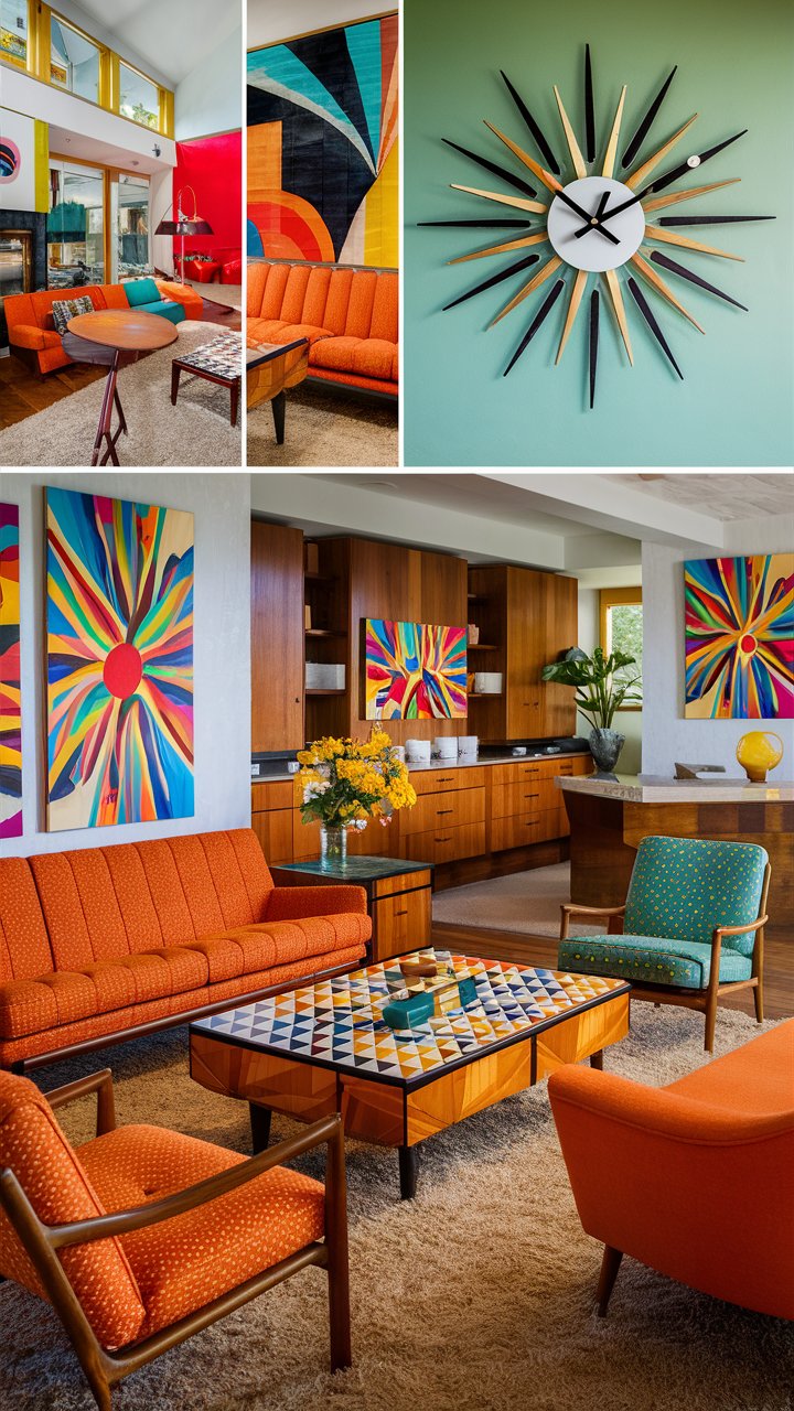
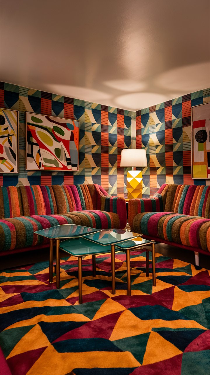
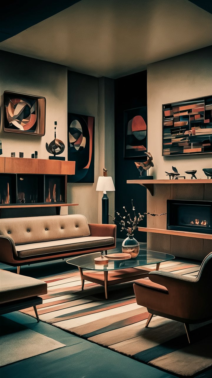
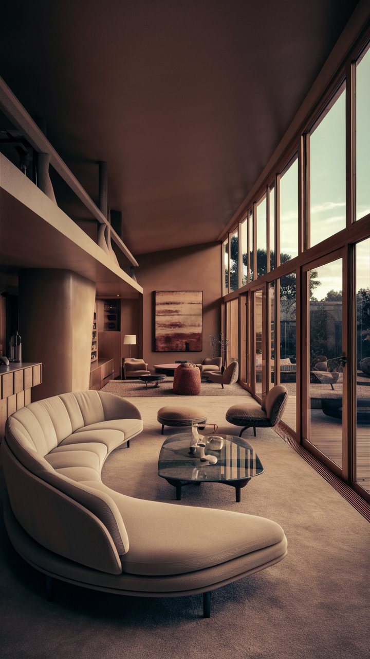
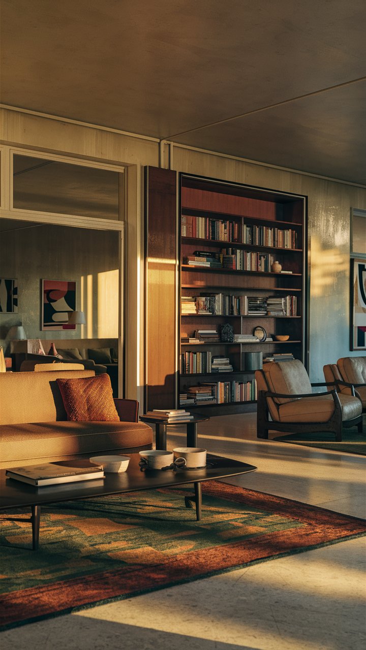
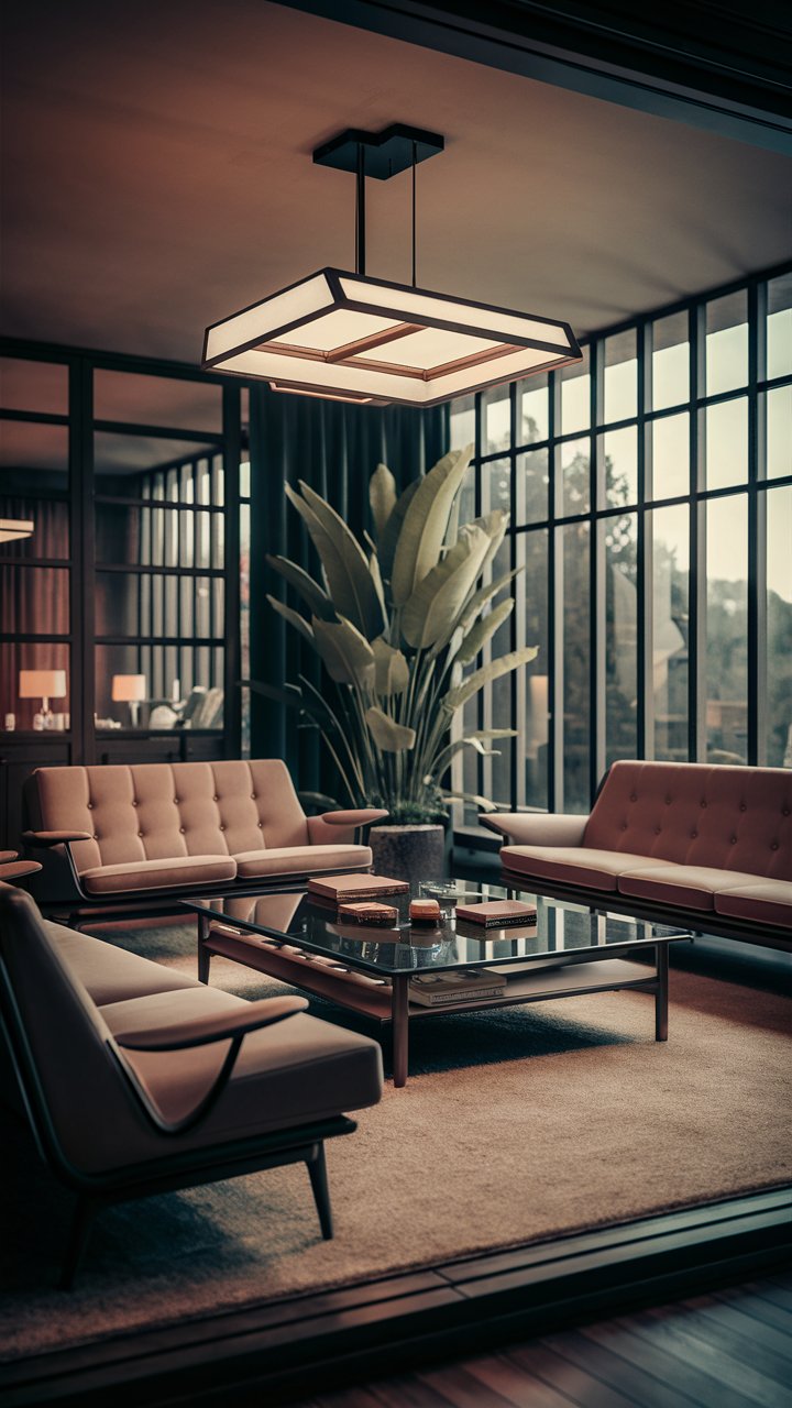
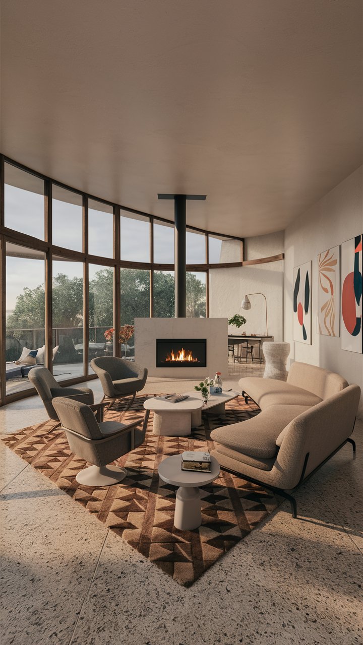
Mid-century modern architecture is celebrated for its clean lines, organic forms, and integration with nature. The exterior colors of these homes play a vital role in complementing their unique design elements and enhancing their curb appeal. Choosing the right color not only expresses personal style but also embraces the timeless aesthetics of the mid-century modern movement. In this blog post, we will explore over 25 stunning exterior color options that can transform your mid-century modern home into a showstopper.
From bold ochre yellows and serene blues to muted pastels and rich earth tones, the palette of mid-century modern homes reflects the vibrant spirit of the era. This post will provide you with organized sections of color choices, practical tips for application, and insights on how to choose the perfect colors for your home. Whether you’re embarking on a full renovation or simply looking to refresh your home’s exterior, these suggestions will steer you toward creating a welcoming, stylish atmosphere.
1. Vibrant and Bold Colors
The mid-century modern aesthetic is no stranger to lively colors. Options like bright orange, deep teal, and sunny yellow can inject energy into your home’s exterior, making it stand out in any neighborhood. Bright orange, for instance, can canvas an expressive door or window frames, offering a warm welcome to guests and passersby.
When employing bold hues, consider their placement. For instance, an all-over application may overwhelm a home that’s already architecturally unique. Instead, complement the natural wood tones often found in mid-century homes by using these vibrant colors as accents. A playful contrast, such as deep teal trim against natural wooden panels, can add an elegant touch without overpowering your home’s design.
2. Earthy Tones
To enhance the connection between your home and its surrounding landscape, earthy tones can be a perfect choice. Shades like terracotta, olive green, and warm browns echo the natural elements around your property, creating harmony. Terracotta can be particularly stunning as a primary color, providing a beautiful backdrop for vibrant plants and landscaping.
These colors work well in places that benefit from an organic aesthetic. Those residing in wooded or lush, green surroundings often find that earthy colors resonate beautifully with their landscaping. Pair these tones with rustic outdoor furniture for a cohesive look that embraces both comfort and style.
3. Soft Pastels
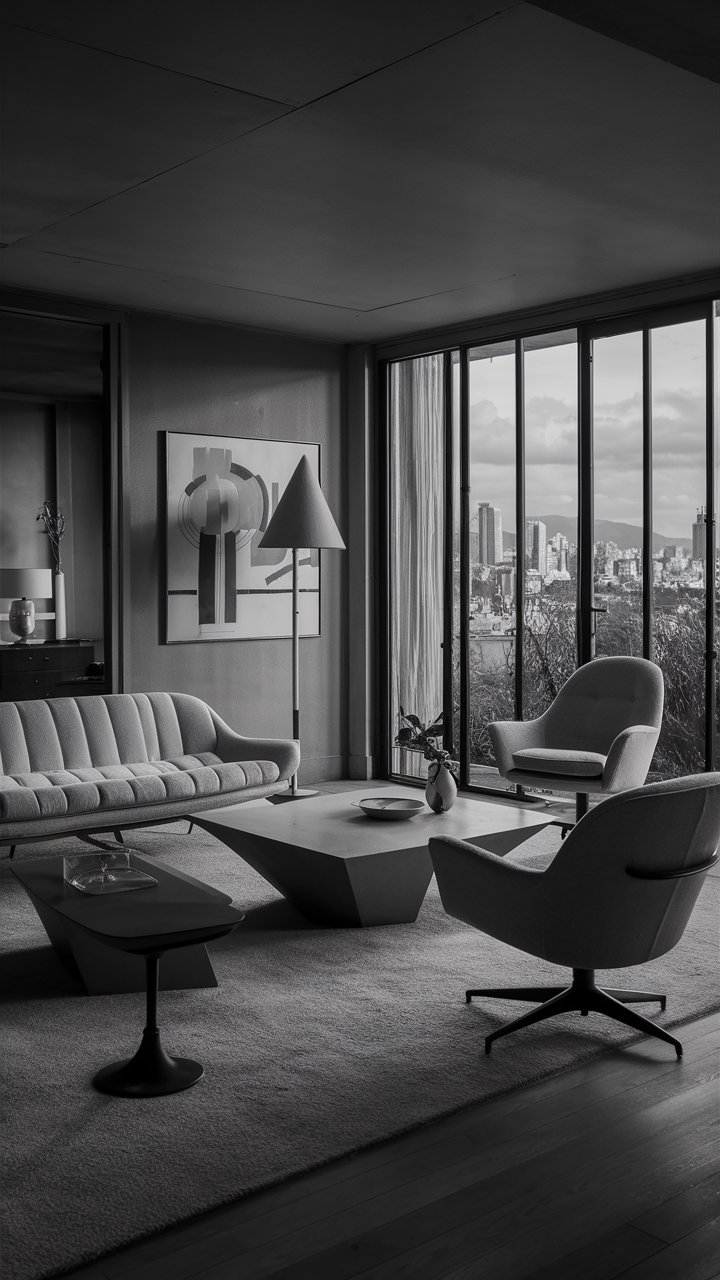
For those who prefer a softer touch, pastels can breathe new life into a mid-century modern home. Colors like mint green, pale pink, and soft blue can create a light, airy feel that captures the essence of retro design while remaining contemporary. These colors can illuminate spaces that might otherwise feel dull, subtly enhancing their characteristics.
For practical application, consider soft pastels for doors or accents in a neutral-hued home. The contrast can be both minimalistic yet striking, perfect for homeowners looking to make a statement without overwhelming their aesthetic. For example, pale pink doors against a white or grey facade create an inviting contrast that is truly enchanting.
4. Neutral Base Colors
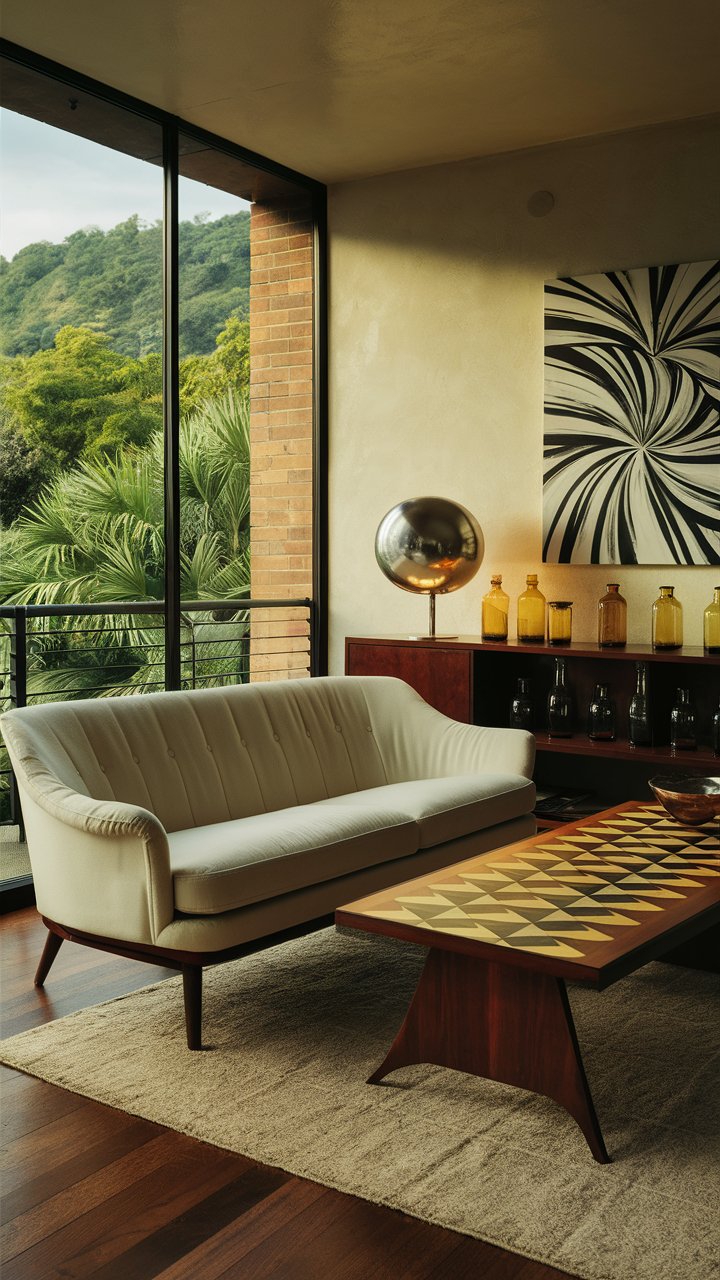
A neutral color palette is a safe and sophisticated choice when designing your mid-century modern exterior. Options such as shades of grey, beige, and white provide a timeless backdrop that can highlight architectural features and landscaping. A grey-hued exterior, for example, can blend seamlessly with various outdoor elements.
The key to successfully utilizing neutral tones is to incorporate depth through texture and accent colors. For instance, pair a light grey with darker grey trim or warm wooden accents to create dimension and interest. Additionally, don’t hesitate to employ vibrant houseplants or landscaping to introduce a splash of color against a neutral backdrop.
5. Two-Tone Combinations
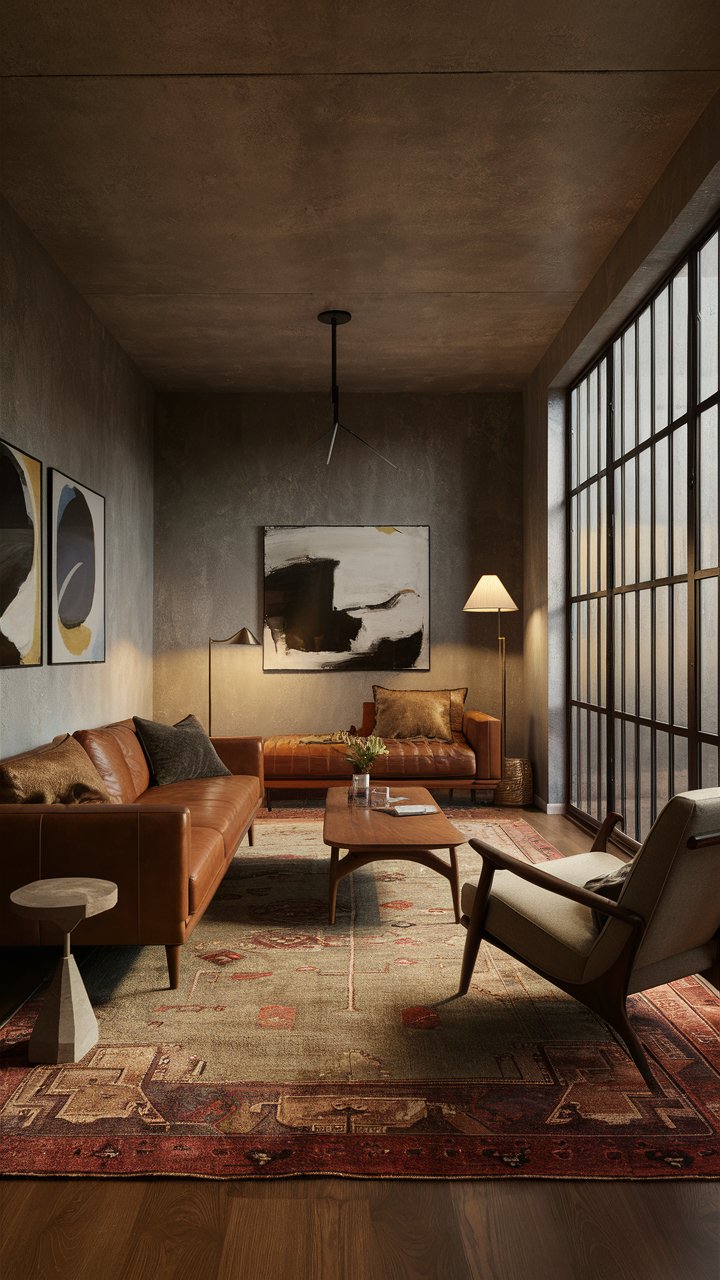
One exciting trend is the use of two-tone color combinations, allowing homeowners to blend contrasting colors effectively. Consider pairing a vibrant hue with a more subdued base color to create layers of intrigue. For example, a rich navy can work wonders as a primary color against crisp white trim, offering a classic but modern look.
This approach allows for creativity in expressing personal style while maintaining cohesion throughout your mid-century design. Pairing textures, such as matte with glossy finishes, can further elevate this contrast, showcasing the unique trim or architectural details of your home.
6. Color Psychology in Your Choice
Each color evokes different emotions, which can influence how your home is perceived. For example, blue often conveys tranquility and trust, making it an ideal choice for a serene retreat, while yellow adds warmth and cheer. When selecting a color, consider how you want to feel in your space and what atmosphere you wish to cultivate for visitors.
Understanding color psychology can aid in making intentional decisions that align with your envisioning of the space. For instance, soft greens may promote calmness and relaxation within the context of a mid-century modern garden — perfect for a peaceful outdoor escape.
Conclusion: Transforming Your Curb Appeal
Investing time in your home’s exterior colors is essential for enhancing curb appeal and expressing personal style. Whether you opt for bold shades to inject excitement or choose soothing neutral hues for tranquility, the choices in mid-century modern colors are vast and varied. Remember to harmonize color with your home’s architectural features and the surrounding landscape to create an inviting atmosphere.
As you embark on your color journey, consider the practical examples and actionable tips shared in this post. No matter your preferences, you can find the perfect palette that reflects your aesthetic and enhances your mid-century modern home’s charm. Enjoy the process of discovery and embrace the creativity in transforming your space into a true reflection of your unique style.
More Living Room Inspiration Gallery
